Color is one of the more powerful cues that people respond to. Color is used by people to convey themselves, their feelings, and their qualities. Understanding how people react to colors is useful in a variety of marketing situations so it’s a good reason to understand the power of colors and color psychology.
Human reactions to various hue stimuli have the potential to impact purchasing decisions and enhance sales. And while we cannot guarantee that the reactions will always follow the pattern, color psychology can be beneficial to marketing. You can utilize influential colors in your marketing material and web design. Opt for web design services from an experienced company to make the process easier.
Over the last decade, there has been a steep rise in the number of studies on the psychological impact of color in marketing and branding. It is due to the fact that the color and aesthetics of a product and its packaging largely affect buying decisions. Consider the last product you bought from a certain brand. Do you recall what color the logo was? Probably yes – perhaps even more so than the cost of the item itself.
Color theory, paint buckets, and palettes are no longer only for artists; everyone in marketing needs to know the essentials. This is why it is critical to comprehend how color psychology might affect your marketing in both positive and negative ways.
What is Color Psychology?
The study of how colors influence people’s perceptions and behavior is known as color psychology. Color psychology in marketing and branding is concerned with how colors influence consumers’ perceptions of a brand and whether or not they persuade them to consider specific brands or make a purchase.
When producing marketing materials, starting a new firm, or rebranding an existing one, it is necessary to consider this subject of study. Consider the following: Researchers discovered that up to 90% of rapid judgments about products can be based just on color in a study titled “Impact of Color on Marketing.”
Despite several research articles on the subject, the psychological impact of colors on the human mind remains a mystery. The truth is that no one color appeals to everyone, owing to a variety of human experiences. Your color-inspired marketing strategy could do wonders for the business when paired with the right content marketing tools.
How Can Colors Influence Your Emotions?
Every hue has a globally understood meaning that conveys a particular emotion. Before we get started, let’s go over some basic colors and the emotions they might provoke, as well as some well-known brand examples:
Orange

Because it mixes red’s force and vigor with yellow’s warmth and enjoyment, orange has a fascinating psychological meaning. Orange is a good picture of physical comfort in our warmth, food, and shelter because of the combination it presents. Orange is also a motivating color that promotes a good outlook and general excitement for life. Overall, orange is a terrific color to use in your marketing and branding to comfort during difficult times and create a sense of excitement or freedom.
Orange is often associated with:
- Positive emotions like friendliness, joy, confidence, vigor, courage, warmth, innovation, and energy.
- Negative emotions like frustration, ignorance, immaturity, and laziness.
- Produces a warm and inviting atmosphere.
This color is used by several sports team mascots, like the Miami Dolphins, since it emanates determination and vitality. It is also linked to entertaining, entertainment-oriented television channels like Nickelodeon and TNT. Orange has a variety of cultural connotations. In the United States, for example, orange is frequently linked with prison clothing. Orange is associated with royalty and spirituality in numerous civilizations around the world.
The way our eyes interpret orange in our surroundings has an impact on how we feel about the hue. If the color orange conjures up images of peaceful autumn evenings, it is likely that the viewer will associate it with good strong feelings. On the other hand, if orange conjures up images of convicts in the observer’s mind, it may have negative implications.
Yellow

Yellow is the color of joy, happiness, brightness, optimism, and everything else you can think of. It is typically associated with happiness and positive emotions. Yellow has a relatively long wavelength, making it one of the most potent psychological meanings while simultaneously being the most visible color. Use yellow if you want to uplift someone’s emotions, boost their confidence, or inspire them. Yellow, on the other hand, is also known to make us feel more critical, which can lead to self-esteem issues, dread, or anxiety. Find the appropriate amount of yellow to inspire rather than depress others.
Yellow is often associated with:
- Positive emotions like warmth, optimism, happiness, creativity, and intellect.
- Negative emotions like fear, trepidation, worry, frustration, cowardice, and irrationality.
- Youngness is represented by this color, which looks best when paired with other contrasting colors like red. Traffic intersections, road signs, and emoticons are all examples of this.
Nikon, DHL, and BIC are just a few brands that have used this psychologically appealing color in their logo design. You can also use this as part of your marketing strategy, however, always remember the positive and negative sides of color before utilizing it. Yellow is thought to stimulate the neurological system, boost memory, and sharpen the senses, making it appropriate for use in the workplace, according to psychologists.
It activates our intellectual potential and is linked to the left cerebral hemisphere. The color yellow also encourages people to talk. It is frequently utilized in conference rooms since it encourages creative brainstorming and activities.
Blue

Blue is noted for its dependability and trustworthiness. It is regarded as responsible and calming to the mind. Blue is one of the most popular colors in the world for that reason alone. Unlike red, blue elicits a mental rather than a bodily response, allowing us to de-stress, cool down, and imagine the best-case scenario. Unfortunately, it is also one of the last hues to be noticed, and if used in large volumes, it can be perceived as distant, chilly, or unpleasant. When it comes to creating relationships, especially in marketing, blue is a well-liked color that may convey a sense of tranquility and trust.
Blue is often associated with:
- Positive emotions like trust, loyalty, logic, serenity, security, and calm.
- Negative emotions like coldness, emotionless, unappealing, and unfriendly.
- It has a relaxing impact on the psyche and is commonly utilized in Feng Shui and interior design.
Blue gives you a feeling of safety and dependability. As a result, companies like American Express and LinkedIn, which manage a lot of personal and sensitive data, adopt it. There is no dearth of companies when it comes to which organization uses blue in branding.
However, most of them are business to business focused firms. As these companies deal in large order volumes and transaction sizes, they prefer using blue to illicit trust among the buyer. It helps them promote their products without spending too much on initial brand-building efforts.
Purple
Purple is most renowned for its mysticism and inventiveness. It combines the vitality and force of red with the stability and dependability of blue, creating the ideal physical-spiritual balance. Purple is frequently associated with wealth, loyalty, bravery, mystery, and enchantment. It is a fascinating color since it relaxes while yet leaving room for mystery and fresh ideas. This is why the color purple is frequently connected with creativity. When utilizing purple, do not use it too much because it can lead to excessive reflection or distraction when your mind wanders.
Purple is often associated with:
- Positive emotions like wealth, mysticism, imaginativeness, wisdom, sophistication, and spirituality.
- Negative emotions like aggression, hostility, unfriendliness, rage, danger, and suffering.
- Often employed by royalty and high-end goods to project a sense of prestige.
Excess, extravagance, and decadence are all associated with the color purple. Confectionery businesses such as Cadbury and Milka use it in their logos and ads. This color is frequently described as mystical, spiritual, and visionary.
Purple is a rare and exciting color since it occurs so rarely in nature. If you are wondering what colors go together to form purple, it is a mix of blue and red. Purple is frequently considered a particularly regal color because it is strongly associated with royalty.
Magenta

Magenta is associated with romance and love, it is widely used in affectionately themed chocolates and cards doled out on Valentine’s Day. Magenta is also supposed to instill a sense of tranquility among observers. It is often thought of as a feminine color, conjuring up images of kindness, gentleness, and compassion.
Magenta is often associated with:
- Positive emotions like passion, invention, originality, and uniqueness.
- Negative emotions like impulsiveness, extravagance, rebelliousness, and sauciness.
- The most popular hue for depicting femininity and youth. It is a symbol of optimism and comfort.
Barbie, Cosmopolitan magazine and Victoria’s Secret are just a few examples of well-known companies that use magenta. It is also linked to organizations that raise awareness about certain issues, such as the Susan G. Komen Foundation for Breast Cancer Research and Awareness. Magenta is an extra-spectral color, which means it does not appear in the visible light spectrum. Rather, it is viewed physically and psychologically as a blend of red and violet/blue light with no green elements.
Green

Green is a color that represents harmony and balance. Green combines a balance of both the logical and emotive, giving us a clearer feeling of right and wrong. Green is a common color in nature, representing vitality, leisure, and tranquility. It is also a symbol of progress, whether in the form of a tangible object like a plant or our financial well-being. Green is the hue to use if you want to convey health, relaxation, and stress relief. It has a greater favorable effect than most other shades, despite slight negative elements such as over-possession and consumerism.
Green is often associated with:
- Positive emotions like hope, health, nature, growth, prosperity, balance, and harmony.
- Negative emotions like boredom, envy, possessiveness, and consumerism.
- A pleasant color that represents vitality and the natural environment. Wealth and power are inextricably intertwined (for instance: banking, military, and economy).
Whole Foods, John Deere, and Animal Planet are examples of companies that utilize this color in their marketing and branding efforts frequently. Notice carefully, and you will find several common elements, including the color, among their organizations. Green has a calming effect on the mind, relationships, and physical health. Green is also known to aid healing and decrease stress.
White

White is often associated with cleanliness and hygienic qualities, making it a popular color for dentistry, health care, and child services businesses. Whitespace also gives the impression of a blank canvas, a great or ideal environment for the brand to live in. Sony and others have done this to great advantage. Whitespace needs a larger canvas, which feeds into the concept of conspicuous spending — intentional ‘waste’ to emphasize riches and richness. The product stands out even more because it is set apart from the competitors’ branding.
White is often associated with:
- Positive emotions like innocence, purity, cleanliness, and simplicity.
- Negative emotions like emptiness, plainness, caution, distance, and coldness.
- The color that most people relate with modernity and simplicity.
The color white has always been associated with purity. It is also been reinvented as the pinnacle of modernity, thanks to companies like Apple, Google, and Wikipedia. White logos are also common among successful firms such as Zara, Apple, Tesla, and Sony.
White is the most popular color on ecommerce websites. It will most likely be the backdrop color for your product image. The majority of your pages will have a white background with black text. This is because the greatest color combination for reading is black font on a white background.
Black
The cover of space, of vastness, is black. It is also the traditional ink color; therefore, it is a favorite of firms who want to appear established. As a result, premium brands frequently employ black to create a blank canvas on which they highlight the item – black draws attention to the object because it is the only thing illuminated. Because too much black might appear oppressive and dreary, it must be utilized sparingly to create a striking contrast with the product. Several hotels employ the color to evoke a sense of luxury.
Black is often associated with:
- Positive emotions like power, security, elegance, authority, substance, and refinement.
- Negative emotions like coldness, heaviness, grief, oppression, and depression.
- A striking and contrasting color that is commonly used to promote sleek and sophisticated products.
This classic color is used by businesses such as The New York Times, Nike, Nespresso, and L’Oréal to convey authority, strength, and elegance. Rolls Royce has a full campaign dedicated to modernizing black’s timeless elegance.
Black is also a common font color since it is simple to read. To achieve a certain tone or consistency on their website, some firms pick black and white photography for lifestyle banner graphics or icons.
Red
The color red is associated with vitality and health. Simply put, it is a color of contrasts. Anything that is red is exciting. Perhaps this is why the color red strongly links with Ferrari, whose automobiles excite us so much. The color red increases hunger. YouTube and Netflix use red to whet your desire for more entertainment. Heinz and Coca-Cola do the same thing in the food and beverage industries. H&M for disposable fashion, Marlboro for cigarettes… the list goes on and on. Red is also the color of danger, thus, it conveys a sense of urgency.
Red is often associated with:
- Positive emotions like power, passion, excitement, energy, and fearlessness.
- Negative emotions like aggression, hostility, unfriendliness, rage, danger, and suffering.
- It instills a sense of urgency (for example, police and ambulance sirens, stop signs, clearance sales). Red is also linked to physical activity, such as heart rate and blood pressure.
Fast-food chains such as McDonalds, In-N-Out Burger, and KFC commonly employ it to stimulate appetites. Red is sometimes also known as the color of love. Several brands make extensive use of this color during valentines week as part of their marketing and branding strategy.
Brown
Brown is a hue we are evolutionarily more accustomed to, even though we spend most of our time staring at gray and magnolia in modern life. The color brown is most often linked with food companies. It is used by Hershey’s as a promise of what’s within. UPS and Kettle Chips, as well as hundreds of independent brewers, use brown. Brown provides us with a balance of warmth, familiarity, and comfort. Brown has depth, richness, and nurturing qualities. There’s a balance of strength and simplicity. While it is a subtler shade than many others on this list, its impact should not be overlooked.
Brown is often associated with:
- Positive emotions like strength, dependability, security, safety, and sophistication.
- Negative emotions like loneliness, melancholy, and isolation.
- The color brown is often used in food packaging with green to imply that the food is organic, natural, or the packaging is eco-friendly.
The brown color is commonly used in ads, uniforms, and logos by companies including UPS, Hershey’s, and J.P. Morgan Chase. Reliability, dependability, and nurturing traits are all qualities associated with this color.
Also, read
- Graphic Design is My Passion -30 Best Memes
- 7 Father’s Day Marketing Campaign Ideas for Businesses & Marketers
- Google Word Coach Vocabulary Builder Game-Everything You Need to Know About
Color Psychology: A Brief Explanation
Here is the meaning of different colors that you can use in your brand’s marketing. You must always remember the color psychology principles before you make any long-term color branding decisions.
- Orange signifies joy and confidence. It is the go-to color for ‘tough products’ of the decade.
- Yellow signifies happiness and creativity. It is ideal for brands that are trying to connect with kids or establish an optimistic link with customers.
- Blue signifies loyalty, security, and calm. Brands that are not working for customer-facing products are more likely to use blue in their marketing than any other sector.
- Purple signifies imagination, wisdom, and prestige. It is also called the color of royalty as several kings from Europe adorned purple outfits during their time.
- Magenta signifies passion and uniqueness. While it is often considered a ‘feminine color’, it is a widely used color in men’s clothing and appliances.
- Green signifies nature, growth, and prosperity. These days, it is widely utilized by food companies to promote their products as organic and naturally grown.
- White signifies innocence and purity. It is also associated with cleanliness and is widely incorporated in several luxury and top-of-line brand logos.
- Black color signifies power and elegance. It is a go to choice for brands that are trying to attract customers to an expensive or a limited edition product.
- Red signifies power and passion. Sometimes, it is also referred to as the color of love.
- Brown signifies strength and safety. It is possible that you may not remember brands with a brown logo as quickly as you can remember other colors, but when you think of it, there are many companies that utilize this color in their marketing.
Choose Color Combinations Effectively
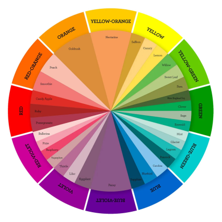
Source: Close To MyHeart
The color wheel can assist you in selecting excellent color combinations for your call-to-action button, infographics, and lead capture pop-up. Maintaining a minimal color palette will benefit you in the long run.
According to a University of Toronto study, those who used Adobe Kuler favored simple color combinations that relied on only two to three favorite hues, got more interactions from customers. People want simplicity; if they do not have to interpret your material through various colors, it will be easy for them to understand. Remember that every color has a meaning, thus, each color contributes to or detracts from your message.
A message with too many colors is confusing. So, how do you pick those two or three colors? The color wheel can be of assistance. If your website design is not optimized according to the color wheel, you must consider getting a website redesign service. It will help you establish a strong brand identity among users.
How Can the Right Color Help Differentiate Your Brand?
According to studies, our brains prefer instantly recognizable brands; thus, color is a key factor to consider when developing a brand identity. According to one journal article, it is critical for new firms to use colors that set them apart from established competitors.
Choosing the appropriate color for your brand might help it stand out. Consider the Isolation Effect, a psychological principle: An item that “sticks out like a sore thumb” is more likely to be remembered.
People are considerably better able to detect and recall an item, be it text or an image when it stands out glaringly from its surroundings.
How Can A Wrong Color Damage Your Brand Identity?
An advertiser’s brand image might be harmed if they adopt the wrong color palette. For example, if an advertiser uses improper colors or fonts on their website, it can detract from the user experience by making it difficult to read or comprehend.
If advertisers use colors that are identical to those of their competitors, they run the risk of being completely disregarded. It is crucial to note that not every customer has the same reaction to color. These shades affect people differently depending on their culture, region, memories, and, occasionally, gender.
Colors will elicit different reactions in different people. We all have distinct experiences with colors depending on major life events, culture, geography, and recollections.
Conclusion
Color is an important marketing tool since it influences our thinking and acting. Our eyes are directed by color to where they should look, what they should do, and how they should interpret something. It contextualizes information. It assists us in determining what is significant and what is not. That is why, as a marketing professional, you need to know what colors signify to different people.
Despite the fact that color psychology has been studied and examined over time, color’s psychological impact remains moderately subjective. Because we all have previous experiences with colors from significant events, cultures, people, and memories, we do not all react to colors in the same way.
Frequently Asked Questions
How is color psychology used in marketing?
Color psychology in marketing and branding is concerned with how colors influence consumers’ perceptions of a brand and whether or not they persuade them to consider specific brands or make a purchase.
Which colors are the best for marketing?
The color red is associated with strength. It grabs and holds people’s attention, which is why it is the most popular marketing design shade. You can find common call to actions painted in red, as it is a popular tile color among professionals. However, if you are looking to establish trust among people, blue could be the color for your marketing strategy.
How do colors affect customers?
Color influences a customer’s impression of a product or service based on the emotion they associate with that product or service’s behavior. A blue and white logo, for example, generally elicits a peaceful, soothing response from customers. Red, orange, and black will each elicit a different reaction.
What colors grab attention on social media?
Between 2009 and 2011, Georgia Tech researchers looked at the color trends in over 1,000,000 Pinterest images, comparing the most and least shared images. They discovered that the colors red, purple, and pink encourage people to share, whereas the colors green, black, blue, and yellow discourage people from doing so. That is because those three colors, red, purple, and pink, elicit carnal, visceral emotions in both men and women, such as failure and pleasure.
