A year after launching the Keyword Planner, Google made the first major update to the tool last week and added a set of new features to make it highly visual and more powerful. These updates are likely to make the tool less time consuming and more useful for marketers.
With the new updates to the Google Keyword Planner, advertisers get a deeper insight into data over time, mobile trends, mobile device volumes, the effect of mobile bid adjustments, enhanced location breakdown for sub geographies and much more. Have a look at the new additions and find out how they are useful for SEO:
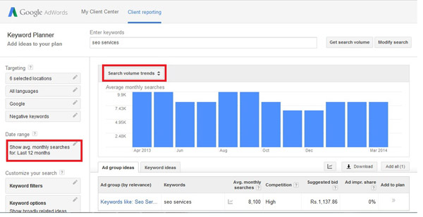
Visualize Search Volume Trends: Webmasters can now get keyword suggestions and volume estimates within a specific time period. A bar graph showing details on every month will provide a visual of changes over time. You can just move mouse over each bar to view details on each month separately.
The example below shows a request for data on SEO services keyword. The blue bar shows the monthly search volume for the keyword over the last 12 months. You can mouse over each bar to see the number of searches made in that particular month for SEO services. By adding the new graph feature, Google has made it easier to get a quick view into the trends and seasonality of one or more keywords.
As it always did in Keyword Planner, a chart appears just below the graph showing the monthly average search volume by each keyword. A small graph icon, beside each keyword displays a smaller graph showing the search volume trend for that keyword.
 Compare VS Previous Time Period: You can also perform keyword volume comparisons based on specific time period. These are displayed in a visual graph. If the time period is set from January 2014 to March 2014, Google will compare and display results for October 2013 to December 2013.
You can also perform time period comparisons for “same period last year”, or “custom comparisons”. If you select the period from January 2014 to March 2014, Google will compare the results with January 2013 to March 2013. You can create your own custom comparison too. After setting the specific time period, click on the “Compare” button in the Date Range section to show the data compared to any other date range. When you set the Compare button to “ON”, Google will graph the comparison time in a second series for easy visuals.
You can also see absolute and relative changes for each ad group and keyword volume comparing two time periods. The total change and percent change columns will determine which keywords are in-flux and which are on the decline.
Comparing Mobile Trends with Other Devices: Google is now showing the distribution of mobile vs. desktop searches in Keyword Planner. You can visualize and compare mobile trends with that of other devices. While mobile trends will be displayed in green, the total volume across others devices will be in blue.
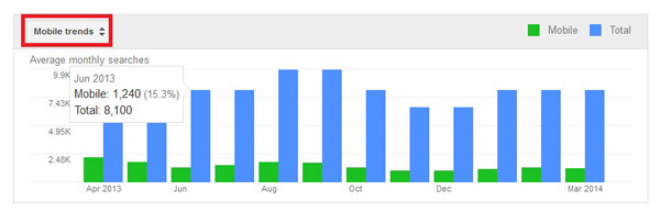 The graph above shows how many people use mobile to perform a search on a particular keyword. This makes it easier for marketers to find opportunities for logical mobile bid adjustments.
Breakdowns by Device and Location: Data is presented in the form of a visual graph to allow advertisers understand the expected contribution from all devices. Get a breakdown of volume estimates by each device and different geo-targeting options.
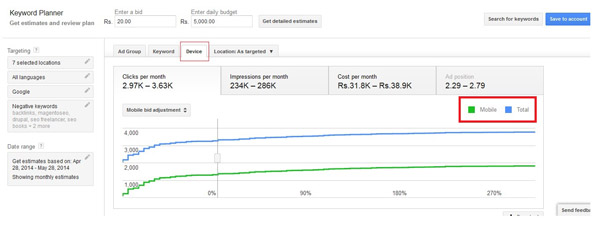
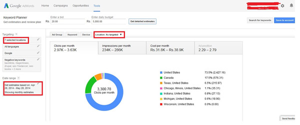 To add or remove locations you can just go to the targeting area.
Flexible time periods: Apart from daily estimates, you can also get results on monthly, quarterly and annual basis. Advertisers can also specify the period of time on which the estimates are based.
Powerful Visualizations and Estimates: Depending on your choice of geography you will see a visualization that breaks out locations with volumes. If you are targeting a particular area, you can now see estimates for the geographic targeting you have specified or select from one of the automatic breakdowns for further details of your targeted location.
The above additions make it easier for advertisers to understand seasonal fluctuations and compare date range functionality. Another significant advantage is that it brings the Keyword Planner beyond the desktop and helps you connect with the right people at the right time, in the right place. It allows for more mobile focus by identifying mobile trends and opportunities for mobile volume through bid adjustments. It also helps in understanding mobile volume trends over time and breakdown of volume estimates by mobile devices. Apart from these, by investigating locations targeting and impact of traffic volumes by location, it allows for better messaging and bid modification.


