Every aspect of your online presence is affected by the quality of your website design. When visitors to your website want to learn more about your brand, your site is the first thing they see. Additionally, it is the most significant factor in increasing your website’s search engine visibility.
Search engine optimization (SEO) can be significantly impacted by web design. Because users prefer to engage with websites where they can easily navigate through the content, you should use designs that are appealing to both humans and search engine crawlers in order to maximize your return on investment.
Having access to online platforms like WordPress and Wix can make website design seem simple. However, optimizing your website design for search engines like Google is not something that these platforms can assist you with. A well-integrated web design is much more than just pretty. Google values user-friendliness over aesthetics when ranking websites. It is true for all sites including ecommerce sites. So, what is the best ecommerce design for SEO and how does web design impact SEO?
Why is Web Design Important for SEO Success?
When designing an ecommerce website, SEO best practices must be taken into account in addition to aesthetics and content. SEO is influenced by your website design in three different ways. Let us look at each of them.
SEO and Human Experience Are Inseparable
A well-designed website can boost your SEO ranking, while a poorly designed website will hurt it. It’s never about ranking a site on a search engine. The search engine bots make an effort to imitate human user experiences. What is harmful to human users is also harmful to information-seeking bots; They share many similarities. Visitors will leave your website if it is poorly designed and difficult to use, making it difficult to generate leads there. The search engine will eventually begin to de-rank your website.
Algorithms are used by search engines, and if they detect a significant issue with your website, its rankings will gradually drop. People won’t be able to engage with your website if it loads slowly, has text that is hard to read, or has an outdated design. To ensure that both humans and search engine crawlers can easily access your website, ensure that you adhere to best web design practices.
Also Read: How to Build an eCommerce Website From Scratch – Everything You Need to Know
Makes the Site Search Engine Friendly
SEO and web design go hand in hand. Nowadays, web designers make the deliberate decision to incorporate SEO into the design process. So, how do these two work together?
Your website will eventually prevent search engines from accessing your content if it is beautiful and attractive but not optimized for search engines. Content on a website that cannot be accessed by search engines will not appear in search engine results. Making your web design optimized for SEO involves a few aspects, including content, navigation, links, and technology.
Helps Use Your Marketing Budget Well
SEO is the most cost effective method to reach your target audience and create leads. However, SEO is a long-term strategy that requires monthly maintenance to produce results over the long term. SEO may take some time, but once you start seeing results, you will see a significant increase in organic traffic and return on investment with minimal maintenance.
Paid marketing, or PPC, on the other hand, is expensive and only good for a short time. If your web design is SEO optimized you would not have the need to go for paid advertising. Since the results are long-lasting and less expensive than those of other marketing channels, SEO optimized web design is the preferred strategy for the majority of businesses.
Web Design Elements that Affect SEO
When you think of SEO, what comes to mind? Most likely technical issues, keywords, or content are the probable things. However, I would argue that design is heavily connected to one of our work’s most crucial phases, particularly in e-commerce. Let me tell you why:
SEO = “Navigation Optimization”
Search engine optimization is the process of making a website or webpage more visible to search engines. Be that as it may, looking at this logically, search is basically a type of navigation. It just so happens that this navigation goes beyond your website. This is equivalent to using a navigation menu or faceted navigation to get to this category when someone searches for a ” leather sofa.” The difference is how simple it is for them to do so, particularly across the entire internet. However, you must have these categories in place for this to work.
These are referred to as “entry points,” and all you need to do is divide up all of your products, establish the various search terms that customers would use to locate them, and then create distinct product categories for each of these. They will perform better in search visibility if these categories are in place and easily accessible via a user-friendly design. Your e-commerce conversion rates will likely rise as a result of the faster and simpler product navigation. Let us discuss the different design elements that need to be optimized in a website.
Also Read: How Much Does An eCommerce Website Cost in 2025: A Complete Guide
Design for Navigation
There are five fundamental aspects of navigation that are influenced by design and have a strong connection to your SEO performance.
Main Menu
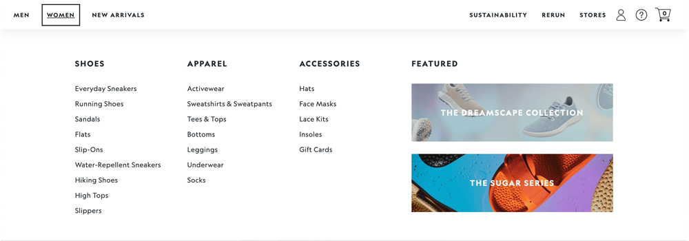
This is the main point of exploring through your site. It is essential for both ecommerce SEO and user experience. Several distinct core collection links, shop by menus, a shop mega menu, or a combination of these are available to you here. The critical thing here is how easily accessible your different collections will be. A simple shop menu may be sufficient for small businesses; find an illustration below:
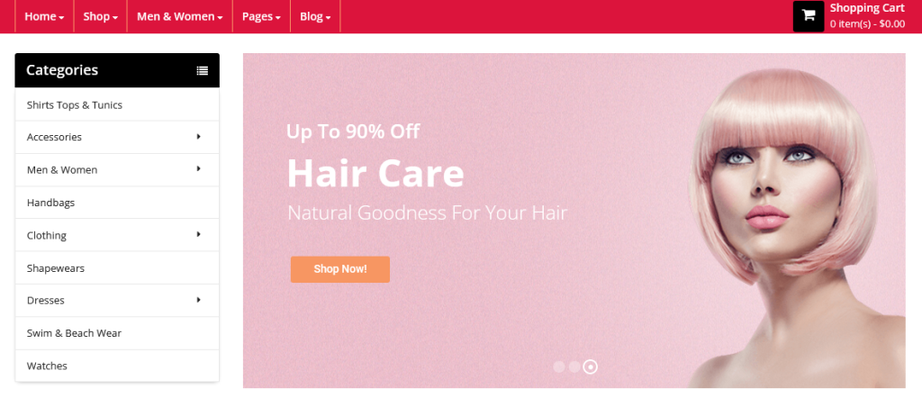
But what if you sell a lot of different products? a store selling supplements, for example. Pre-workout supplements, amino acids, and other items are available. After that, there are six subcategories within each of these. Is forcing a user to click the link for protein supplements, load the page, and then choose vegan protein user-friendly? No, these ought to be accessible through the menu. Through a menu called “Categories,” you can provide various choices:
And after that, you can get even more complicated. You might have goal collections, room collections, brand collections, style collections, and so on. This is what we call a “Shop by” navigation. Here is a model for an electronics seller:
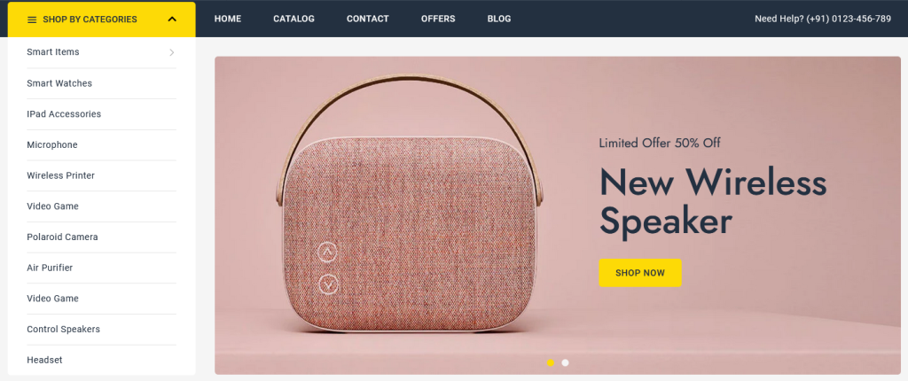
Every one of these thoughts presents a better client experience by working on the navigational experience. There is no need to open multiple pages, narrow down the options, or click incessantly. All it takes is a single click from the main menu, which is on every page. Making these changes not just prompts better SEO by essentially having the pages set up, which increases your brand’s keyword potential, it also performs better by displaying these pages; the better their performance, the less clicks they require to navigate.
Faceted Navigation
Faceted Navigation is the filter-filled sidebar that appears alongside your product grid. It’s an important part of the ecommerce shopping experience, yet most brands don’t perceive how detrimental it tends to be to SEO when overseen ineffectively. An illustration from a computer store online is as follows:
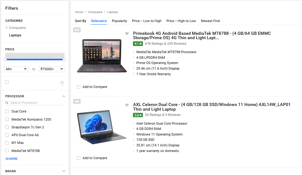
This clearly benefits the user; if you have a wide range of products with a variety of differences, it is extremely helpful to quickly narrow these down. But, each ecommerce business handles these at different levels of detriment to SEO. This can be handled by some WooCommerce plugins by creating a new product category page for each filter:
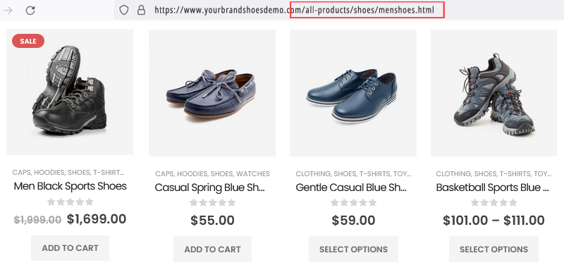
This can be exceptionally gainful to search engine optimization, however without critical administration will probably prompt an enormous number of copy classes, inferior quality/unsearched classifications, and an overall wreck. On Shopify stores, a different configuration that is flawed but simpler is used by default. The faceted navigation in Shopify 2.0 themes is controlled by filter parameters and optional meta fields. An example from Blindstyle:
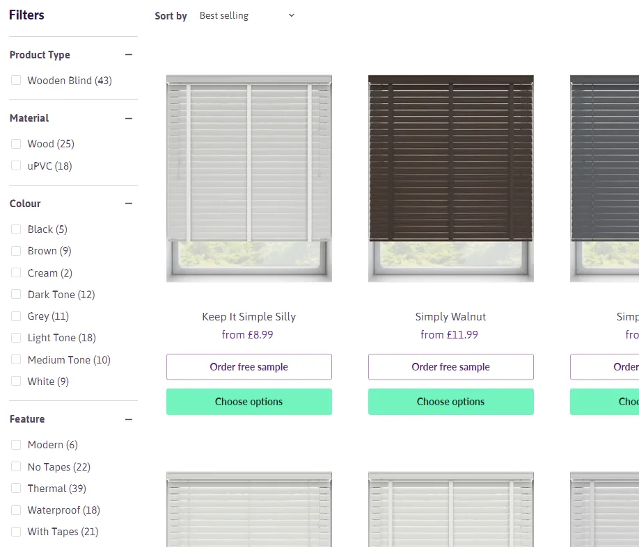
Although this results in less overall trouble, none of these options are pages that can be indexed. Therefore, you will need to manually create a collection for each of these topics in order to rank for them as keywords. In general, you should think about whether you need faceted navigation, which options to show if so, and how this will affect SEO in your particular use case.
Filtering of Subcategories
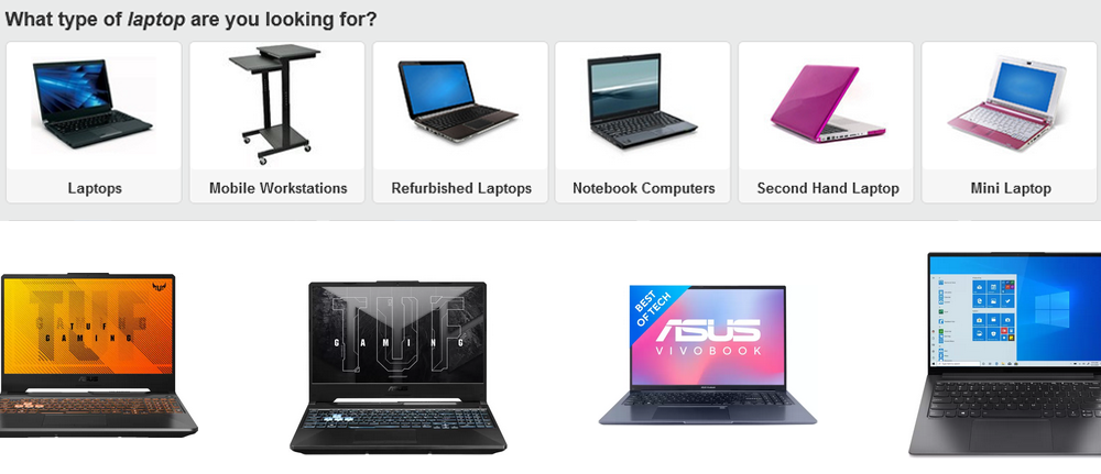
One navigational component that is usually under-used is sub-category links especially in the form of a visual swatch. You can have visual subcategory links in addition to your faceted navigation for further narrowing down the category:
The functionality of giving option to filter by range is another example of this:
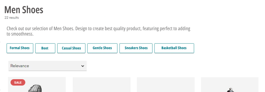
From a user’s perspective, these links make it easy to get to popular categories that are relevant to the page they’re reading and likely of interest to them. This is easier than searching through 50 to 100 filters for options.
From a search engine optimization (SEO) point of view, these links show search engines the topical relevance between these various categories and reduce the number of clicks required to access them, which is another important ranking factor. Similar to the below example, this can also be implemented at the bottom of the page:
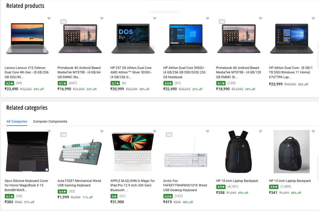
However, this is typically reserved for links that are less user-friendly and relevant, such as well-known brands, products, or searches/categories that are very specific.
Product Grids
If you’re an ecommerce brand, you probably know what a product grid is:
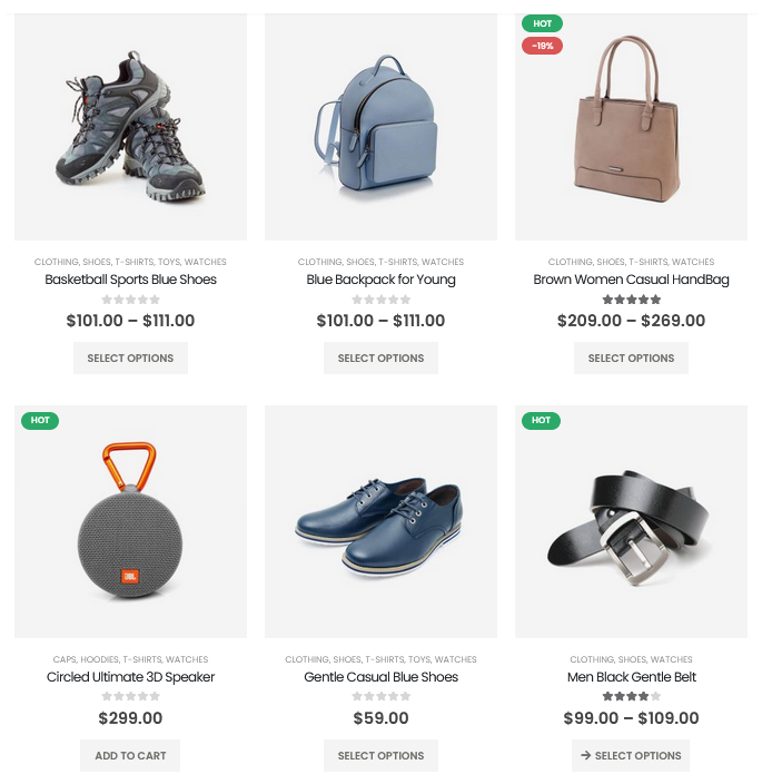
But have you ever thought about how it affects search rankings? Three SEO considerations probably went unnoticed here:
- 4.1 Viewing with JavaScript Disabled
Have you tried navigating to your product grid without JavaScript enabled? While many well-known apps do not support JavaScript, the majority of ecommerce platforms do.

Many apps will display a loading animation that never stops, or in the above case, an empty page, when JavaScript is disabled. This is of little worry for the end-client experience, seldom do clients disable JS. However, crawling this product grid by search engines is a concern. You see, search engines these days can crawl JavaScript, but they don’t do it very well and shouldn’t be relied on. It is not mission-critical if you are in this position. It’s likely that your products are crawled successfully. However, if you have the chance to learn best practices, we would encourage you to switch to a solution that does not rely on JS.
- 4.2 Number of Products Displayed
More content on a product category page typically results in higher rankings. This can refer to category descriptions or even the number of products that are displayed on the page. The number of products displayed in the grid is more important to the user than the depth of the description. Showing more items allows a simple navigation without utilizing pagination or filtering.
Taking a product from being buried 36 pages deep to half of that is a win for your SEO because it also reduces the amount of pagination. Even better, place them on the first page of a subcategory, reducing their depth to just two pages. Essentially, increase the number of products displayed in your grid. You don’t want to load 36 product images at once, so use lazy-loading only.
- 4.3 Product Details
The majority of product grids look like this:
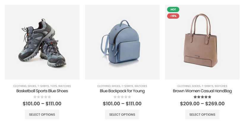
This is fine, and in many instances, it is more than sufficient. However, in some instances, it may be more user-friendly to display more information.
Stories Flooring, for instance, displays a little table of product details:
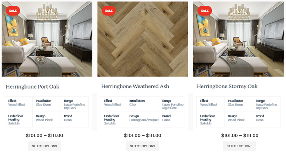
High-level technical specifications are shown by HP:
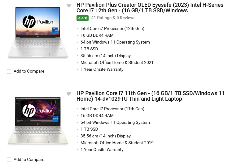
Without having to apply filters or go to the product page, these additional product details can provide extra context. Because they add more content to the page, they are also great for SEO.
Linking of Products
Another underutilized point of navigation is your product pages. What number of product pages do you have? Over a thousand products are owned by a typical seller. However, they rarely purposefully design these pages’ navigational elements to benefit users or search engines. Let us look at some examples.
- 5.1 Breadcrumbs
Breadcrumbs are a great way to connect to a product’s primary category and hierarchical subcategories. If your category contains 149 products, you are missing 149 internal links by not using this. Additionally, it is much simpler for your customers to find additional products that are similar to what they are browsing. Take note of the below illustration:

To quickly return to the category that is most relevant, simply click “Shop” from the main menu.
- 5.2 Tag-style category links
Tag-style category links are another option if a user is unable to find what they are looking for in the primary or subcategories. You can also include a navigation element that is just for the collections that this product is a part of. The implementation by Origin Nutrition is a simple illustration of this:
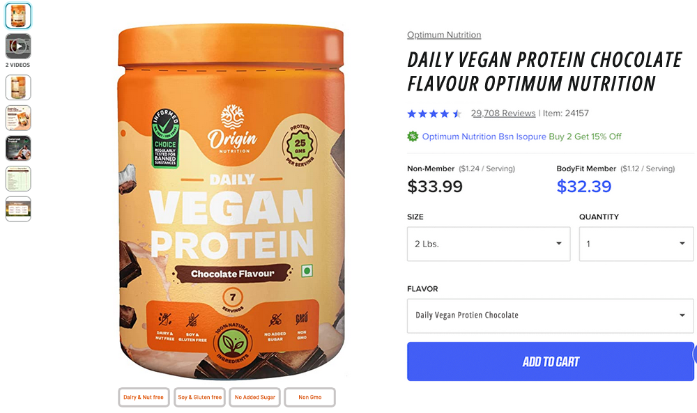
However, for an even more user-friendly approach, this can be extended into yet another menu of the “Shop By” variety. Sony is an excellent illustration of this:
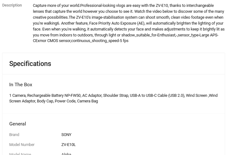
Each product is labeled with information about the species it can be used with, the techniques it can be used with, etc. Then, at that point, each of these are connected to the significant classifications for each item. It is extremely user-friendly and generates thousands of internal links to various product categories.
- 5.3 Product Variants
If you sell visually differentiated items, it is ok to show them as separate products as opposed to product variants. Instead of opening each product one by one, this lets you quickly choose a picture from the pages for the various product categories. The disadvantage is if you’re on the product page, it can be difficult to explore the next variety or style choices for comparison.
Product swatch links are the solution to this problem. For instance if you look at the below image, you can access the alternative product page by clicking on one of these color swatches. A simple, however useful solution.
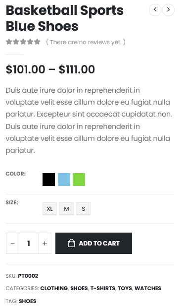
- 5.4 Related Products
You’ve probably seen a section titled “Related Products” or ”Similar Products” on most of the websites like the one below.
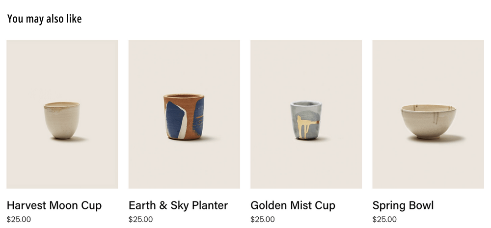
While these are frequently used to boost conversion rates and average order value (AOV), they should not be discounted as an SEO strategy. By highlighting relevant products, you’re bringing more internal links to the surface, which makes it easier for people to find pages and ultimately improves rankings.
User Experience (UX) Design
The opportunities that were listed earlier concentrated on aspects that have a direct impact on SEO performance; however, it is also important to take into account the benefits that are indirect.
Conversion
You will likely see an increase in conversion rates if you make your website more user-friendly, reduce the number of clicks, and overall look better. To comprehend this point, you do not even require data. If a customer comes to your store in search of chocolate protein powder, are they more likely to buy it if they can locate it in two clicks as opposed to four clicks? That’s right. Click-through conversion is another method of conversion.
We’ve observed that product grids with “Choose options” buttons have a higher click-through rate than those with no buttons at all. While minor, this addresses increased time on site, which impacts rankings.
Time spent on the Website
It’s important to think about how bad SEO can hurt your users’ experience. Spammy content above the fold is the most common problem, which leads to low time on site and a high bounce rate (also known as SEO killers). Check out this cosmetics website:

On a cell phone, their items are around a 3 finger scroll down the page, on a page for categories. Not only will this kind of low-quality content affect your rankings, but it will also kill your conversions. If you are employing this strategy, you should address it immediately. It’s fine to give in-depth descriptions, but make sure to conceal them behind a “read more” button or carefully arrange the pages.
Other Factors of Web Design That Affect SEO
Images and Videos
With all of the great camera and video technology available, it can be tempting to include as many of the most stunning high-resolution images and videos as possible on your website. Tragically, large image and video files can consume a large time to load in the event that they’re not optimized as expected. Obviously, search engines take website speed (and page speed) into account while deciding a site’s positioning on results pages. Again, their ultimate objective is to give their customers a good experience, so they don’t want to send them to a website that takes a long time to load.
How long is “excessively lengthy?” If your page takes longer than three seconds to load, the bounce rate increases to 58%. There are a number of free tools available to help developers and marketers comprehend the speed of their desktop and mobile websites. Google PageSpeed Insights, one of these tools, looks at the content on your website and makes a list of priorities for improving your page speed.
Images and videos have the potential to drive conversions and increase engagement when they are optimized for mobile and web viewing. Keeping an eye on how the speed of your page is affected by new and existing graphics will help ensure that they are not affecting your organic search performance.
Fonts and Themes
Relax if you are concerned that Google will evaluate your font selection and rank you accordingly; Your organic search rankings will not be affected in any way by the font you choose. However, your font and theme selections do have an effect on the user experience, which, you guessed it, has an impact on SEO.
Utilizing a large number of various text styles, themes that are hard to process, or text dimensions that are excessively little (or too huge) to be read effectively all decline the nature of your client experience. That is taken into account by search engines. Make sure your fonts and themes are legible on all devices and consistent with your brand across all properties when conducting a font audit. Your bounce rate will remain low and search engines will receive a positive signal from a well-organized experience.
Mobile Friendliness
In today’s world, a responsive website is a non-negotiable requirement. However, the mobile experience still receives less attention than the desktop experience in many businesses. Mobile devices account for more than half of all website traffic; however, in today’s world, with the ever-increasing number of mobile phone users, that percentage is going to skyrocket. It is normal to rise considerably further.
However, that global average does not apply to every industry. The majority of B2B businesses, for instance, report significantly more desktop traffic than mobile traffic among customers who browse during the day.
Therefore, why must mobile still come first? Google indexes the mobile version of a page first, to all the more likely assistance to their clients to find what they’re searching for. This means that, regardless of whether the majority of your site sessions take place on a desktop computer, your mobile content needs to load quickly and be optimized for smaller screens. In addition to a mobile-friendliness rating, Google’s “Mobile-Friendly Test” offers mobile usability reports and resources to help you with all of your mobile content initiatives.
Hierarchy of Headers
Online readers of today expect to find the information they need more quickly than ever before: Only 16% of website visitors read the text word-for-word. Headers give your pages structure and help visitors understand what you cover on each page, reducing the likelihood that they will leave without reading further.
Also, while the significance of including keywords for header tags (H1 through H6) has come into question, 80% of first-page results on Google utilize a H1 header. Not including a header is like publishing a story without a title, since the reader doesn’t know if the story is relevant to them, they probably won’t read it. Use a tool like Screaming Frog or SEMRush’s Audit Tool to learn how your website uses headings and identify areas for improvement.
Format Consistency
If you have the questions, how to rank in featured snippets and how to begin increasing your rankings for significant keywords, then format consistency is the answer. The standardized layout of a website makes it easier for search engine spiders to crawl its content. For example, the success of Wikipedia, which has the highest percentage of featured snippets on the internet (11.2%), may inspire you to take the decision to alter the format of your content.
In Wikipedia, every article has the same layout, with the first paragraph appearing most frequently in voice search results and featured snippets. The ease with which search engines can crawl your website will be reflected in how simple it is for users to comprehend the relevance of your content. Your organic search performance will benefit from what is beneficial to users.
Final Thoughts
SEO professionals and web designers now have a variety of options to ensure that the design of the website is SEO-friendly thanks to technological advancements. Your website’s user-friendly design will help you rank well and get more visitors. SEO and design are heavily linked.
Web design can have an effect on how users feel, but it also helps a website grow and get a higher ranking on search engines. Your site’s SEO ranking may suffer as a result of poor web design. Since this has an immediate impact on your business’s bottom line, investing in SEO-friendly web design from the beginning is essential. Combine website design and SEO best practices to construct an alluring site that is visually pleasing and also ranks high in search results.
FAQs
Is good web design important for SEO success?
Web design plays a crucial role in SEO success since it helps in converting leads and also makes the web crawlers easily navigate your site which will give you higher rankings in search results.
What are the web design factors that affect SEO?
Fonts and themes, hierarchy of headers, consistency of the format are some of the web design factors that affect SEO.
What are the various product linkings I can do on my site?
You can link the related products, product variants, and tag the relevant categories in the product page of your site.
