The online world is a bustling marketplace, and your landing page is your digital storefront. It’s the first thing your potential customers see, and it’s your chance to make a lasting impression. But, crafting the perfect landing page is no small feat. It requires a strategic blend of compelling design, persuasive copy, and intuitive functionality.
So, what are the key Attributes of a Good Landing Page? How can you optimize each element to capture your visitor’s attention, pique their interest, spark their desire, and ultimately, compel them to take action? In this post, we will delve deep into the top 7 attributes that make a landing page truly effective.
From crafting compelling headlines to creating strong calls to action, we’ll unlock the secrets to transforming your landing page from good to great. So, buckle up and get ready to embark on a journey to unlock the full potential of your landing page.
What Is a Good Landing Page Experience?
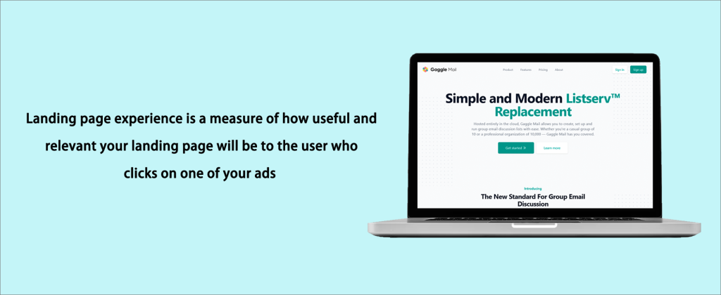
The landing page experience is pivotal in most pay-per-click (PPC) advertising as it influences the value and relevance of your landing page to users who click on your Google ads. It essentially gauges the probability that potential customers will find what they are seeking and have a pleasant time on your landing page.
This experience is assessed and categorized as “average,” “above average,” or “below average” in the world of Adwords, based on the likelihood that visitors will find satisfaction and have their needs addressed on your landing page.
It is crucial to ensure that each landing page aligns with the keywords and advertisements used to attract visitors to it to comprehend the attributes that contribute to a positive landing page experience. The page itself should also be useful and valuable to the visitors.
Transparency in your interactions with visitors is key. Both your expectations from them and what they can expect from you should be clearly articulated. Collectively, these factors influence the effectiveness of your landing page experience.
Armed with this knowledge, you can identify various landing page designs that may be adversely affecting your conversion rate and take the necessary actions to improve it. The experience of your landing page is just one of the factors considered when determining your Quality Score, which significantly impacts the efficacy and success of your PPC campaigns.
Hire a dedicated paid advertising agency to masterfully design landing pages that captivate and convert. Their expertise ensures every click counts, maximizing your campaign’s success.
What Is Quality Score?
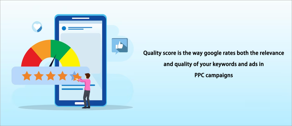
Google’s Quality Score is a metric used to evaluate the quality and relevance of your PPC campaign’s keywords and ads. Both your cost per click (CPC) and maximum bid are based on this rating, making it incredibly important.
Google Ads calculates your CPC and ad rank during the ad auction process by multiplying your chosen bid by your quality score.
Although the exact formula for calculating the Quality Score is not publicly available, we know that it considers several factors:
- CTR: The percentage of users who click on your ad after seeing it.
- Keyword relevance: Ensure your keywords are closely related to the ads they trigger for each ad group.
- Landing page relevance and quality: How well the page aligns with the user’s expectations and the advertisement.
- Ad text relevance: How relevant your ad text is to the keywords it uses.
- Historical performance: How well your account has performed in the past with Google Ads.
While CTR is the most significant factor and constitutes the majority of your Quality Score, the exact weights assigned to other factors are not publicly disclosed.
This approach is logical as it indicates that your ads are relevant and helpful to consumers when a higher number of prospective buyers view your ad on the search engine and click on it.
Indeed, a high-quality score significantly boosts your ad ranking, making it highly visible to everyone. This not only increases the visibility of your ads but also ultimately saves you a considerable amount of money.
In essence, a high-quality score is akin to a magic wand for your advertisements. It allows you to stand out in the advertising industry while managing your advertising costs. Therefore, pursuing a win-win scenario is a smart strategy for any savvy advertiser.
Also Read: Understanding the Differences: Google Display Network vs Search Network
Which Attributes Describe a Good Landing Page Experience?
There are actually two distinct categories of “good” when it comes to landing page experiences. Let’s explore the first type by breaking them down.
The first category of a strong landing page experience is achieving an above-average score for landing page experience in search ad campaigns. To ensure your landing pages are deemed effective, you must comply with the strict criteria set by search engines. These criteria include relevance, transparency, and user-friendliness.
Effective landing pages must prioritize relevance. It’s essential to align the information on your landing page with the content in your ads. For example, directing readers to a landing page about toasters when you are promoting weight loss is both deceptive and counterproductive.
Transparency is another crucial aspect. It’s vital to avoid misleading your audience or omitting important information. For example, it is deceptive to promote your product as having a fixed price of $10 when it initially costs $10. Building trust with your users begins with being honest and transparent.
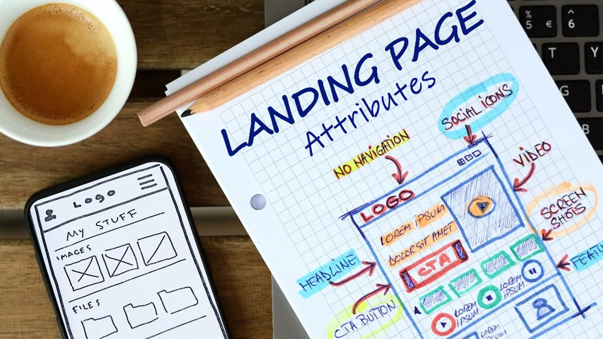
Now, let’s discuss user-friendliness, which is also incredibly important! You want visitors to your landing page to find it easy to navigate. It’s acceptable to forgo a traditional navigation menu; just ensure it is easy for users to find what they are looking for.
Your allies here are large, prominent call-to-action buttons; they will guide users to the actions you want them to take. And let’s make it easy for someone to leave your page if they want to – no hard feelings! Conversely, if people choose to convert and take action, let’s make that process straightforward and effortless for them.
To ensure your landing pages are successful in search ad campaigns, remember that the first type of good landing page experience focuses on satisfying the criteria set by search engines. By placing a high priority on relevance, transparency, and user-friendliness, you can enhance the overall experience for your visitors and increase the likelihood that your campaign goals will be achieved.
Relevant and Original Content
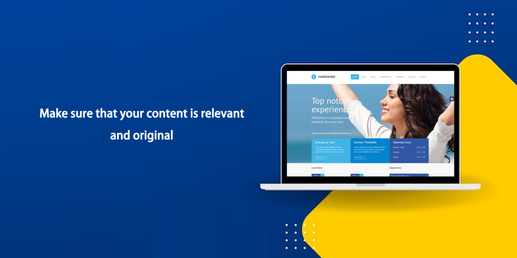
It is critical to keep the content relevant and original when attempting to create a top-tier landing page experience. Relevance is key to defining a good landing page experience, leading to lower bounce rates and higher conversion rates.
The first step is ensuring that your page directly corresponds to the keywords and ad text. Be precise when users are looking for something specific. For instance, ensure the landing page is focused on women’s white tennis shoes if your search phrase concerns such shoes.
Conversely, be more inclusive when people are looking for options. Direct visitors to a landing page with a variety of laptop options if they are comparing laptop models or searching for laptops in general rather than one specific model.
It is crucial to provide valuable details about the product or service being advertised. Highlight the unique qualities of your offering that set it apart from competitors.
Consider your landing page’s alignment with your keywords and how closely your keywords match your ads as a starting point for analyzing relevance. Ideally, incorporate as many keywords from your ad group as possible in your ads and landing pages. Use a Single Keyword per Ad Group (SKAG) structure to accomplish this by linking each unique landing page to its corresponding ad group.
Your landing page should clearly convey the key phrases and search terms that brought visitors to it. To increase relevance and attract qualified leads, it can be beneficial to include the exact search query or relevant portions of it on your landing page.
By maintaining a direct connection between what visitors are seeking and the page they land on after clicking an ad, you can ensure a smooth and enjoyable user experience.
Directing people to a relevant and helpful landing page directly impacts the success of your AdWords campaign because relevance is crucial for quality score.
While ensuring relevance can be relatively straightforward by using the correct keywords to optimize essential elements like headlines, titles, forms, and copy, being innovative can be more challenging.
Consider incorporating semantically relevant keywords into the page’s title, description, H1 heading, paragraphs, and alt text for images to increase originality. Use tools like SEO web page analyzers to assess how well certain pages are optimized for their target keywords.
Make every effort to avoid copying content from other websites and keep each landing page original. The uniqueness of your landing page will be evaluated and compared with that of similar advertisers and their products. Well-written text that uses keywords comparable to those in the advertisement can sustain user engagement.
Also Read: How to Use Google’s Responsive Display Ads & Its Best Practices
Simple Navigation
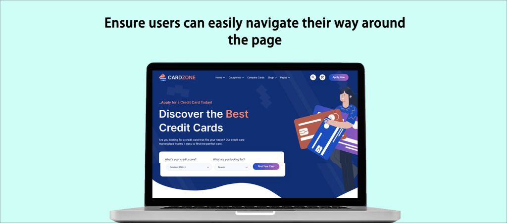
A landing page must have a clean, well-organized design to offer a positive user experience. The goal is to make it simple for visitors to locate the information they need without conducting considerable research.
When creating the website, simplicity and speed are crucial to ensure conversions happen quickly. Avoid any obtrusive elements, such as full-screen pop-ups, that can interfere with the user’s ability to navigate the landing page.
Prioritize the material above the fold, where it is initially visible upon landing on the page, to assist visitors in finding what they need quickly. Even though a landing page shouldn’t often have external connections, it’s a good idea to have anchor links that point viewers to other website areas.
No matter how long the landing page is, users should have no trouble navigating it. For long-form landing pages, a sticky navigation bar is strongly advised; however, if one is not used, make sure the offer that draws visitors to the page is easy to find.
Avoid confusing potential clients with many links to different offers and site sections in the quest to increase conversion rates. This strategy doesn’t lower bounce rates and might even irritate visitors. Keep distractions to a minimum and concentrate on the most critical parts of the landing page experience. External links, unnecessary menus, and sidebars should all be eliminated or minimized as they may deter consumers from performing the required conversion action.
Finally, it is critical to verify that all site functions work correctly and that information is presented understandably to boost user confidence and increase conversions.
Building Trust through Transparency
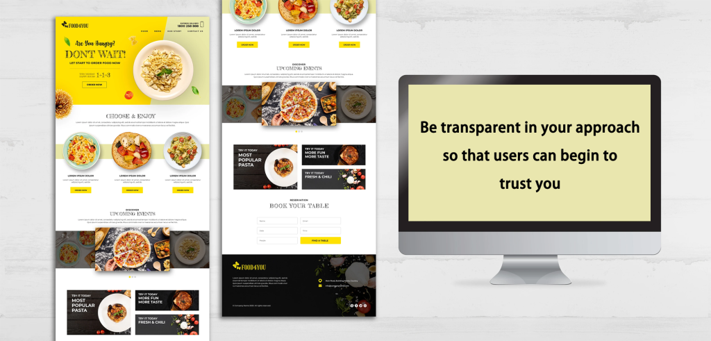
Businesses should be forthright and open about their operations on their corporate website or platform. Building trust necessitates clearly articulating the activities of the organization and providing essential information to people.
Before soliciting user information, it is important to thoroughly describe the services or products offered. This ensures that consumers comprehend what they are engaging with before sharing personal information.
Ensuring the availability of contact information is crucial for fostering consumer relationships. It is recommended to display the company address in the footer and the phone number in the header. This enables users to quickly reach out for inquiries or assistance.
When requesting information from users, it is important to clarify the reason for collecting the information and the intended use. This transparency engenders trust in users and reassures them that their information will be managed properly.
To gain the trust of potential consumers, businesses must demonstrate that they are legitimate and reliable. Adopting a transparent approach encourages people to place their trust in the organization. Additionally, making contact information readily accessible helps to reassure consumers.
Various strategies can be employed to further enhance credibility and transparency. Providing an email address and phone number, along with other contact details, instills confidence in users that they can reach out whenever necessary. A physical address, customer reviews, trust badges, and social media links all contribute to establishing a more credible online presence. The more accessible a business is to potential clients, the greater the trust it can build.
Moreover, when collecting information from users, it is essential to be transparent about the data being collected, including any cookies or information obtained via forms. Users will have peace of mind and a sense of transparency in their interaction with the company if the purpose of the data collection, its usage, and storage location are clearly communicated.
Reducing Landing Page Loading Time
The page must load quickly once a user clicks on an advertisement. Have you ever been frustrated by a website that seemed to take forever to load? There’s a high probability you left to find a faster alternative and didn’t return.
Most users are impatient; thus, they won’t wait for a slow-loading landing page. If consumers have to wait too long for your page to load, they’ll likely hit the back button and click another link. You don’t want to give your potential customers that kind of experience.
Here’s a crucial piece of advice: If your landing page takes too long to load, it doesn’t matter how excellent the copy, form fields, or images are. Users won’t even get the opportunity to view your carefully crafted content. Additionally, Google penalizes websites with long load times because it doesn’t favor slow websites. Your landing page experience status and, subsequently, your Quality Score may suffer as a result.
Consider making your landing page an Accelerated Mobile Page (AMP) if you want to ensure it functions smoothly on both computers and mobile devices. AMPs are designed to load incredibly quickly and offer a better user experience, particularly on mobile devices.
Valuable tools like the Page Insights Tool can help you assess the loading speed of your landing page and pinpoint areas that need improvement. You can use it to optimize your page for quicker load times and gain useful insights about its performance.
In summary, having a quick-loading landing page is essential for enhancing user experience, increasing conversion rates, and maintaining a positive reputation with search engines. Therefore, for a seamless browsing experience for your visitors, ensure that your page loads quickly and efficiently.
Get More Mobile-Friendly: Optimize for Mobile!
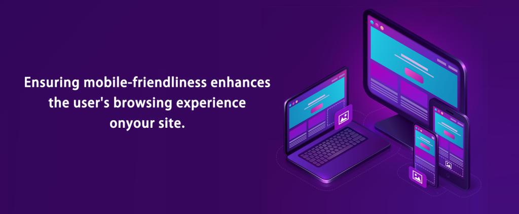
When it comes to making your landing page design mobile-friendly, don’t just settle for the basics; go the extra mile and optimize it, particularly for mobile users. Mobile optimization is crucial for better engagement with your advertisements and target audience, so let’s look at how you can do it for your desktop landing pages. Here are some practical recommendations for each essential component of a mobile landing page:
First, keep it brief, pleasant, and easy to read. Mobile visitors have short attention spans, so ensure the language on your landing page conveys a clear, concise message that is easy to understand at a glance. Create a succinct headline and call-to-action (CTA) copy using action-oriented language for maximum impact.
Next, provide call-now buttons to make it easy for mobile users to respond. They can contact you immediately with just a single tap, greatly improving the likelihood of conversion.
Additionally, clean up your landing page by removing any extraneous elements that can make it load slowly or divert mobile users. A seamless mobile experience is created by keeping everything organized and straightforward.
Make CTA buttons sticky to facilitate easy access. This means that even as mobile visitors scroll down the page, your call-to-action buttons remain visible and prominent, allowing them to take action whenever they’re ready without having to search for it.
Always keep responsive designs, accelerated mobile pages, and mobile-first indexing in mind while creating landing pages. If your landing page is not mobile-friendly, elements like eye-catching images, strong value propositions, and trust signals won’t have the same impact. In order to provide the best experience to consumers on both mobile and desktop, your landing page must start with a strong mobile foundation. This will increase conversion rates.
An Effective Call-to-Action
Where should these potential consumers go to take action after someone has created an enticing headline or persuasive prose to persuade them? The “call-to-action,” or CTA, is where the solution is found. A well-designed landing page is critical. Encouraging visitors to take action is vital, and it should be prominently placed.
It’s also crucial to consider the various types of CTAs available:
- Buttons: Buttons are interactive elements that stand out and entice users to click them to perform the required action.
- Forms: Users can use forms to enter their contact information, such as email addresses and other details, in order to sign up for or access certain offers.
- Banners: Banners are eye-catching images with a clear call-to-action (CTA) button intended to grab attention and prompt clicks.
- Links within the content: CTAs can be subtly placed within the text to direct readers to the desired action as they interact with the content.
- Pop-Ups: These eye-catching boxes or windows often display on screens when specific criteria are met or when a visitor is about to leave the page.
- Slide-Ins: Slide-ins are less invasive than pop-ups but are still prominent features that appear when visitors scroll down the page.
By integrating these diverse CTAs, businesses can successfully direct website users toward conversions and meet their objectives. It is crucial to make the CTAs interesting, relevant, and consistent with the main message of the landing page.
Design and Layout

Making a landing page visually appealing is essential as it will immediately capture visitors’ attention. You want them to have a positive first impression and be interested in learning more.
A good landing page should also be able to tell an engaging story. It’s like taking your guests on a tour while highlighting your business’s main features and benefits. This narrative can help establish an emotional connection and increase conversion rates.
Precisely defining the purpose is crucial so that the landing page aligns effectively with its goals. What do you want your visitors to do? Make a purchase, subscribe to a newsletter, or obtain additional information. Understanding the purpose will enable you to tailor the design to achieve that goal.
Conducting competitor research and studying effective landing page examples may offer insightful tips when developing a landing page. It enables you to understand the components and strategies that are effective in your market. However, highlighting what makes your offering distinct from competitors is just as crucial. To attract customers and persuade them that you have something unique to offer, emphasize your unique value proposition.
While adhering to design best practices is recommended, experimentation should also be encouraged. With the use of A/B testing, you can compare different versions of your landing page to see which one performs better. Using this iterative approach, you can refine your design over time and maximize its effectiveness.
Remember, the goal is to design a landing page that is both attractive and effective. You can create a landing page that stands out and maximizes conversions by combining visual appeal, storytelling, explicit alignment with objectives, competitor analysis, and A/B testing.
How Landing Pages Affect Performance: Good vs. Poor
| Aspect | Good Landing Page | Poor Landing Page | Effect on Performance |
| Relevant Content | The content meets the needs of the user. | The content is not helpful or generic. | It influences engagement and conversions. |
| Great Design/Layout | It appears professional and appealing. | Design is cluttered or unappealing | It influences how users perceive it. |
| Easy Navigation | It’s simple to find what you’re looking for. | Confusion and difficulty in navigating | Impacts user encounter and the amount of time spent on the page. |
| Fast Load Time | Loads quickly | Loads slowly | It impacts bounce rates and experience. |
| Mobile Friendly | Effective on mobile devices. | Poor performance on mobile devices | Alters device focusing, conversions, traffic generating, and user encounters. |
| Clear Call-to-Action | Strong and clear instructions | Unclear or weak instructions | It impacts the number of conversions. |
| Positive Testimonials/Reviews | Good reviews from customers. | No reviews or negative feedback. | It affects credibility and conversions. |
Which Attributes Describe a Bad Landing Page?
In the pursuit of an effective landing page, one must be cautious of characteristics that could undermine its success. Let’s take a look at the attributes that identify a poorly designed landing page:
Unnecessary Elements
When creating a landing page, it’s critical to avoid cluttering it with items that don’t serve the page’s primary purpose. These unnecessary features can detract from the message you’re trying to convey or draw attention away from your call to action.
By keeping your landing page clear and focused, you maximize the likelihood of capturing visitors’ attention and directing them to take the necessary action. So, remember to prioritize the elements that support your page’s goal and remove any distractions that could reduce its efficacy.
Navigation to Other Pages
Landing pages shouldn’t offer the same elaborate navigational options as regular websites. The goal is to maintain a laser-like focus on the critical message and the call to action. We do not want visitors to leave before they have even taken action!
Here’s a helpful tip for anyone using a landing page to advertise their wonderful product or service: try to avoid displaying advertisements for other things on the same page. This has the potential to confuse your visitors and cause them to lose focus on what you have to offer. It’s preferable to keep things tidy and straightforward.
Therefore, always keep your landing page clutter-free, uncluttered, and free of distractions for one that converts like crazy.
Advertisements
When using a landing page to promote a specific product or service, it is recommended not to feature ads for different products or services on that page. Doing so can cause confusion and distraction for the visitors.
Complicated Forms
Keep things straightforward and avoid giving consumers too many fields to fill out when using a form to collect user information. Users may become discouraged from completing the form if it becomes overly complex or requests an excessive amount of information, which could lead to the entire process being abandoned.
The secret to designing a fascinating landing page is to make it successful and effective. The likelihood of turning visitors into buyers will rise dramatically if the landing page is well-designed and user-friendly. Additionally, by using the marketing budget more strategically, this approach will help the company achieve better results.
Conclusion
In conclusion, a successful landing page experience is essential for attracting visitors who will become loyal clients. Businesses and marketers can create landing pages that resonate with their target audience and encourage desired actions by carefully considering the qualities discussed in this exploration, such as a clear and compelling headline, relevant and persuasive content, intuitive navigation, visually appealing design, and optimized loading speed.
A successful landing page should not be considered a one-size-fits-all solution; rather, it should be continuously tested, analyzed, and improved to remain effective and efficient. Consider the user when making decisions and adjust to their preferences and requirements.
In the end, investing time and effort to create a fantastic landing page experience may pay off handsomely, increasing conversions, boosting customer engagement, and ultimately strengthening an online presence. To ensure that your visitors have a satisfying and memorable experience when engaging with your business, seize the opportunity to optimize your landing pages.
FAQs
What kind of content belongs on a landing page?
Provide concise, relevant content that aligns with your advertisement or link. Use persuasive text that emphasizes the benefits of your offer or product while addressing the concerns of your target audience. Include images and videos that help users comprehend your content and enhance their experience.
Why is a landing page’s mobile responsiveness essential?
Mobile responsiveness is crucial for a landing page because an increasing number of people are using mobile devices to access the internet. It ensures that your page adapts and displays correctly on different screen sizes, providing mobile users with a seamless experience.
How can someone evaluate their landing page’s effectiveness?
Use programs like Google Analytics to track metrics such as conversion rate, bounce rate, time on page, and click-through rate. By analyzing these metrics, you can assess the effectiveness of your landing page and identify areas for improvement.
What role does a compelling call-to-action (CTA) play on a landing page?
A compelling call-to-action (CTA) on a landing page serves as the focal point, guiding visitors towards a specific action, whether it’s signing up, purchasing, or another desired outcome. It acts as the bridge between passive content consumption and active user engagement, ensuring that the primary objective of the page is clear and enticing for the audience.
